Brand kit
The logo, the colours, the type.
Everything you need to put Pretty Things Online in a deck, an article, a partner page or a product UI. Take the files as they are — the wordmark is already outlined, so it renders correctly whether or not the font is installed.
Logo
One wordmark, two backgrounds.
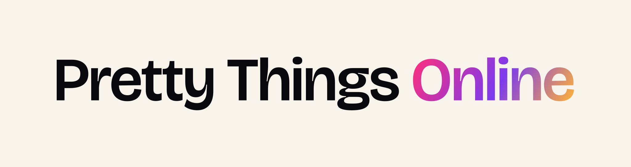
The wordmark is set in Bricolage Grotesque Semibold with the signature gradient on the word Online. Use the dark version on ink and the light version on white or paper. Single-colour versions are in the kit for print, embroidery and watermarks.


Icon
A pt monogram, cut from the same letters.
For avatars, app icons and anywhere the full wordmark will not fit. The gradient square is the one to reach for when the mark has to hold up small.











Colour
Six colours and one gradient.
Signature gradient
linear-gradient(120deg, #ff2f7c 0%, #7c3aed 55%, #ffb238 100%)Ink
#09080dPage background
Paper
#f8f4ecPrimary text on ink
Fuchsia
#ff2f7cGradient stop, 0%
Violet
#7c3aedGradient stop, 55%
Amber
#ffb238Gradient stop, 100%
Mist
#b3abc4Secondary text
Typography
Two typefaces, both free.
Pretty Things
Bricolage Grotesque
Display and headings
The wordmark, headings and numerals. The logo uses weight 600 at optical size 72 with tracking of -0.025em; headings on the site run 500 to 600.
View on Google Fonts →Body copy, set plainly.
Instrument Sans
Body and interface
Everything that is not a heading — paragraphs, navigation, buttons, forms and captions. Weight 400 for body, 500 to 600 for interface elements.
View on Google Fonts →Usage
A short list, honestly kept.
Please do
- Leave clear space around the wordmark of at least the height of the capital P on every side.
- Use the SVG wherever you can — it stays sharp at any size and the type is already outlined.
- Keep the wordmark above 120px wide on screen, or 30mm in print.
- Drop to the icon, or to a solid violet square, when the space is smaller than that.
Please do not
- Re-type the wordmark in a live font, or substitute another typeface.
- Recolour, reangle or reverse the gradient, or apply it to the words Pretty Things.
- Stretch, rotate, outline or add a shadow to either mark.
- Place the dark wordmark on a busy photograph without a solid panel behind it.
Need a format that is not here — a vector for a sign, a lockup with your own logo, or a colour separation for print? Ask and we will send it.
Get in touch